Building Families’ Trust: Self-Service Subscription Cancellation
Problem
How might we comply with California Auto-Renewal Legislation (CARL) with minimal impact to key business metrics?
Approach
I updated our membership settings screen and developed a user flow that met legal requirements for existing customers.
Result
No impact to revenue and decreased customer support labor hours by 35.0%.
Client
Grove Collaborative
Duration
8 weeks (Apr.-May 2020)
My Role
Lead Product Designer
Team
1 Product Manager, 1 Legal Counsel, 3 Engineers
Design Approach
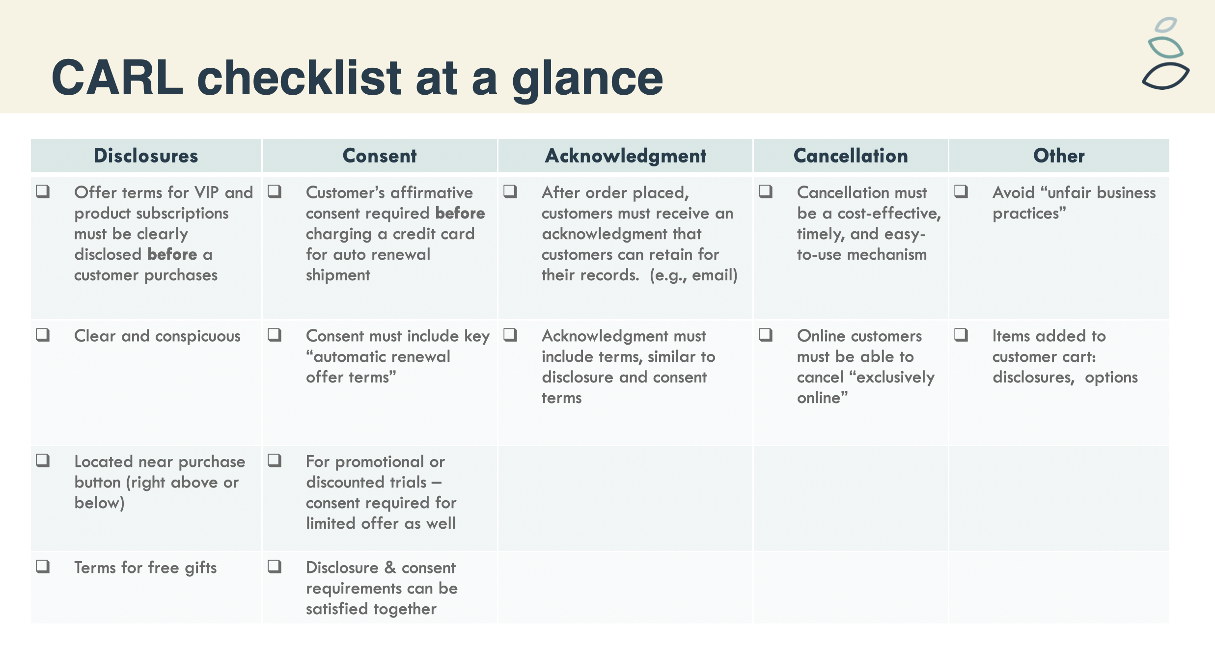
CARL, passed in 2009, requires companies to clearly and conspicuously explain “automatic renewal offer terms”
This required providing disclosures, collecting consent, delivering acknowledgements, allowing cancellation and other considerations.
All of this was intended to be self-service — meaning customers should not be required to jump through hoops to cancel a subscription or membership.
Building For Compliance
Grove’s customer support is known for its warmth and helpfulness. Traditionally, we relied on these agents to “save” customers unsure about keeping their subscription services.
However, this takes up considerable time of our customer support agents and customers feel frustrated, especially if they didn’t know they were joining a subscription service with automatic billing.
Balancing Legal Requirements, User Preferences and Business Goals
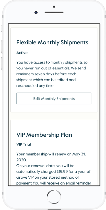
Throughout the design process, I partnered with Legal counsel to understand CARL requirements and analyze the current issues in our existing user flow and screens (seen here).
The law is not prescriptive in how to design experiences, but throughout the process I learned how to look at designs like a lawyer 👩⚖️
The Cancel Button Debate
The best solution for usability would be to provide a cancel button on the very first screen. No extra clicks and a predictable user flow.
Stakeholders wanted to a chance to “save” the cancellation — replicating the context-setting and explanation provided by our friendly support agents.
We already had several marketing-oriented pages that described program benefits and features.
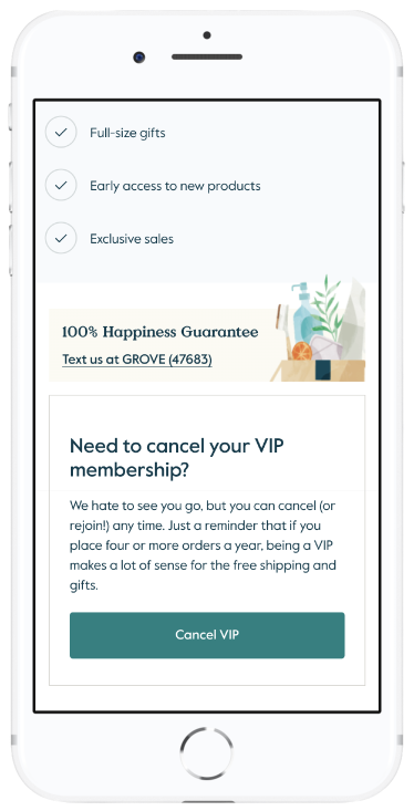
We decided that the settings page could guide users to these summary pages — so we updated them to reflect current subscription status and moved cancellation links up the page.
Even though we added engineering work, this made the pages more valuable for marketing and more helpful for users.
Final Design & A/B Testing Results
After final sign=off from legal and the executive team, we planned our experiment.
We targeted the A/B test on the settings page for all traffic (web, mobile, and apps), and users would be assigned to the variant or control when visiting that screen.
We measured cancellation rates, order values of those who did or didn’t cancel in either experience, and order conversion for future orders.
Final test results showed there no negative impact to order values or future order conversion.
There was an increase in cancellations, but they appeared to be disengaged customers, since other business and cohort metrics were unchanged.
The biggest surprise was a 35% decrease in customer support labor hours (!!) spent responding to cancellation requests.
The test was a success and quickly released to all customers!
“Really excited to see this result. I had to double-check it for myself .... Great result and kudos to everyone for the patience to pull off a test like this”


