SaaS Analytics
Problem
How might we present the health and performance of multiple cloud services to product owners for actionable decision-making?
Approach
I designed a tablet-based app for executives. They could use dashboards to analyze their SaaS portfolio performance according to relevant KPIs.
Impact
My work directly influenced data warehouse architecture and was the first test of the company’s updated design system.

Client
Public cloud computing company
Duration
3 months (Nov. 2016~Jan. 2017
My Role
Lead Product Designer
Team
1 Front-end Engineer, 1 Executive Sponsor (client), 1 Product Manager (client)
Design Approach
We were approached by this client to develop an executive product for assessing SaaS service health and performance. They were in the process of creating the data warehouse and wanted
In partnership with a front-end engineer, I designed the data visualizations and information architecture for a tablet-based app.
As I developed design solutions and applied the corporate design system to my design concept, my engineering partner developed a proof-of-concept build, with data visualization library D3, that served as a template for client engineers.
Design-led Business Frameworks
A core challenge of this project was influencing and staying abreast of ongoing, executive-level decisions. So, I maintained an recurring standups with my client and interviewed diverse stakeholder groups across the organization.
I developed the main app structure from prior research, stakeholder interviews and competitor analysis.

Conceptual Model 1: Greatest Change Since Last Login
Show details for the metrics with the greatest change since last log in.
Pros: Trends-focused
Cons: Deltas depend on data type
The client and I decided to combine the concepts for rapid MVP delivery, while building towards a long-term vision.

Conceptual Model 2: Greatest Distance from Goals
Focus on the service stage goals that a service is farthest from reaching.
Pros: OKRs prioritized
Cons: Dynamic, needs context
Designing Meaningful Data Visualizations

The conceptual model informed our data visualization approach so I developed multiple sketches for three product-critical KPIs. Each metric needed an overview and drill-down view.
It was important not to overwhelm executive users with too much data, but provide enough context for data changes. I chose to add metadata such as events and notes, and integrated intuitive gestures for navigating analytic drill-downs.
I reviewed sketches daily with my engineer to integrate technical concerns and inform the ongoing prototype development.
This saved considerable time by ensuring solutions had parity with our data visualization libraries and their limitations.
Refining the Information Architecture & Interactions
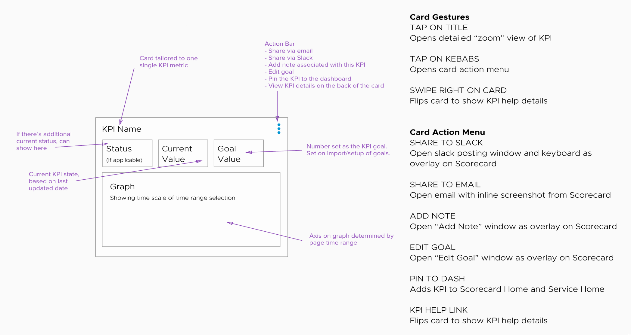
In addition to designing the data visualizations, I needed to ensure the components had scalable interactions and elements.
Cards were important to the product framework because it enabled a way to drill into a specific metric through a series of tap and swipe interactions.
Final Concept

The project was paused because our design process was moving more quickly than key strategic decisions.
Our project timing gave us the chance to utilize the newly-developed corporate design system and platform for analytics tooling, so my designs provided guidance to internal teams on how to leverage new components.
I created a tappable, tablet-friendly Invision prototype to document the interactions and high-fidelity designs.